
Hi Ivo
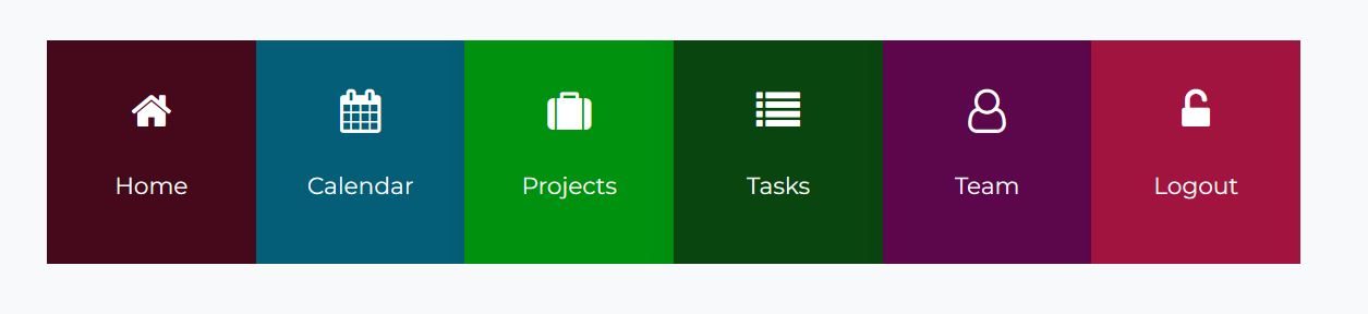
I am creating a employee portal website for my client. Most of the employees will access the portal using mobile/cell phones. I am trying to create a home page which has a layout similar to a mobile app. Currently using features I have created 6 sections which look like below on desktop
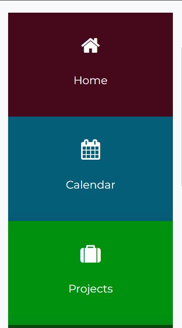
On Mobile they look like this:
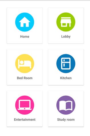
What I really want is 2 columns per row or even 3 so it looks more like these samples apps
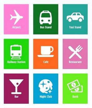
or
How can I achieve this?
Thanks
Lynda
I am creating a employee portal website for my client. Most of the employees will access the portal using mobile/cell phones. I am trying to create a home page which has a layout similar to a mobile app. Currently using features I have created 6 sections which look like below on desktop
On Mobile they look like this:
What I really want is 2 columns per row or even 3 so it looks more like these samples apps
or
How can I achieve this?
Thanks
Lynda
Your Reply
Please login to post a reply
You will need to be logged in to be able to post a reply. Login using the form on the right or register an account if you are new here.
Register Here »
The Joomla!® name is used under a limited license from Open Source Matters in the United States and other countries.
InspireTheme is not affiliated with or endorsed by Open Source Matters or the Joomla! Project.
InspireTheme is not affiliated with or endorsed by Open Source Matters or the Joomla! Project.